Sunday, June 13, 2010

Poppy Medley

Poppy Medley 30x30cm coloured pencil on sanded card.
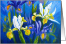
This painting is from the May Plant Parade challenge on Wet Canvas. I cropped one of the photos and painted the underpainting in my usual way but this time using water solouble neopastel and water to  cover the paper. I have used the neopastels for the under painting on several oil pastel paintings and it works well for me.


 Initially I planned to do this painting in oil pastels, but something made me decide to use coloured pencil which I hadn't used for quite a while.
I sharpened my pencils and set to work on stage 2 - making the colours look 'real'
 This is the stage where it starts to look more like the objects. I decided that I need more of this 'colouring' stage and here is stage 2.2
Definitely starting to look like flowers now!
Stage 3 is finding the changes in plane and lights and shadows on the petals by dividing the larger masses into smaller masses.
The light through the petals is starting to show.

Stage 4 is more of the same - splitting the masses and really looking at the colours and pushing them and putting in that all important centre of the main poppy.
I enjoyed painting this one and the coloured pencils worked well on the sanded paper which did not use up the pencils as much as I thought they would.

Monday, March 22, 2010

Spring Jonquils

Spring Jonquils
25x32cm oil pastel on black somerset velvet paper.


The Floral and Botanicals forum of wetcanvas.com January challenge was to paint white flowers. One of the supplied references was a lovely photo of some white jonquils which I couldn't resist. Painting white flowers is quite a challenge for me as I find it extremely hard to get the right balance of white and shadows.
I have started painting in oil pastels instead of the soft pastels to avoid the dust created with the soft pastels. They act totally different to soft pastels and using them is a whole new experience. I really enjoy using them although I consider myself a newbie with them. 


This is my stage 1 where I block in the highlights and shadows with warm and cool colours.


This is stage 2 where I start changing the colours to look 'real'.

This is stage 3 where I look for the different light and dark planes in each block of colour and start the layering process to give a more 3D effect. I am using creams and whites for the highlights and blues and purples for the shadow areas. The flowers are starting to come alive now.


 Stage 4 is more layering, I go over some of the highlights with yellow covering that with more white. I also blend some areas to achieve a smoother change from the highlights to the shadows. After leaving the oil pastel to set for a couple of days, I then look at the painting to assess if there are any final changes needed. I changed the angle of a couple of the petals and layered more whites and blue in the shadows. Overall, I was quite pleased with the result.

Saturday, March 13, 2010

Art cards

I have been selling cards at Greetings Card Universe (GCU) for a while now. I use my paintings and photographs to create original cards. I thought I would share with you some of my art cards for easter/spring available via GCU. These cards make

These cards are a card and gift at the same time as they can be framed as a keepsake by the recipient.

Tuesday, January 19, 2010

Flower studies in pastels

I challenged myself by setting a time limit for these two studies. I allowed myself 20 minutes for each.

I wanted to see if I could achieve a nice loose painterly feel, which I think I have managed. Both of these studies are in soft pastel, on Fisher sanded paper. Both are 20x20cm (8"x8").

The pink rudbeckia painting is my favourite as I love that combination of the pink with the turquoise and I like the lively feel of this one.

I have used this image to create a blank art card available from GCU
Pink Rudbecka Fine Art Card


The mimosa painting was looking a bit dull and I wondered what could be done to liven it up. I remembered a tip I'd been given by another wet canvas member (colorix). Using a grater I grated some soft pastel in yellow and dark green over the painting. This was very effective. I was surprised about how effective this was. A little bit, went a long way. I then pressed the gratings into the paper by applying pressure to a piece of tracing paper laid over the top. The 'bits' have stayed firmly in place.
Mimosa is grown here commercially on the Cote d'azur mainly for the perfume industry in Grasse. In late January/beginning February the hills around Cannes are covered in yellow. A wonderful sight.

I have used this image to create a blank art card available from GCU Mimosa Fine Art Card

Monday, June 29, 2009

Pink Rose


Pink Rose
Acrylic painting
40x40cm on box canvas
 
I painted this rose as part of a monthly challenge on wetcanvas.
The challenge was to paint a rose macro in a colour you found difficult. I always find pinks difficult as they can come out either too sugary, too blue or too red.


The reference is from a rose in my garden. The area where I live, used to be very well known for growing roses for the perfume industry in Grasse. This rose was planted by the previous owners of my property.


Stage 1, Underpainting.
The rose was drawn onto the canvas using watercolour pencil. I then blocked in the darks using cool colours e.g. purple, blues, blue greens and greens, and the lights using warm colors oranges, reds and yellows. I used yellow for where I wanted the lightest highlights.


Stage 2


Paint was added to each area to make the colour look more 'real' I used alazarin crimson for the shadows and permanent rose for the lighter areas, mixed with white to a lesser or greater extent. I used titanium white and some mixing white.


The mixing white makes the colour more transparent, but titanium white gives a better colour, although it is quite opaque. I also mixed the alazarin crimson with ultramarine blue in places.
The paint was added dry, with a scumbling motion. Several layers were used to help get the correct tone.


Stage 3
More pink - permanent rose plus white was added to the light areas. A red layer was also added to the darker areas to give a warmer shadow and then overpainted with alazarin crimson.
To get to stage 4 (the finished piece) I scrumbled a layer of permanent rose all over, before putting on the last coats of pink. The permanent rose layer helped to lessen the 'chalky' look of some of the pink. I also used much thicker paint on the light petals.
Lastly, I used a lot of white in the highlights to give a very light pink and increase the contrast at the focal point.

LinkWithin

Related Posts Plugin for WordPress, Blogger...