After completing my poppy medley, I had the urge to paint more poppies. I gave myself a stern lecture and insisted I finish some half finished paintings first before starting something new.
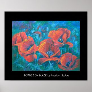
Red poppies on black
I started this one a couple of months ago. It is in oil pastel and I wanted to see if I could portray poppies in oil pastel. I love painting them in soft pastel and I have also painted them in watercolour and acrylic. This is from one of my own photographs of poppies in my garden here in France. I let them self seed every year and as I don't do much weeding they reward me with a wonderful show every year.
RED POPPIES ON BLACK
30x40 cm, oil pastel on Somerset Velvet paper.
The blue stands out a little too much in the photo, although I have reduced it in photshop. It's difficult photographing art work on black paper, if anyone knows of any good tips on how to do it, please let me know. The paper is a lovely paper to work on. It is a printing paper and works well for soft pastel as well as for oil pastels. It has a soft 'springy' surface and takes a lot of wear and tear.
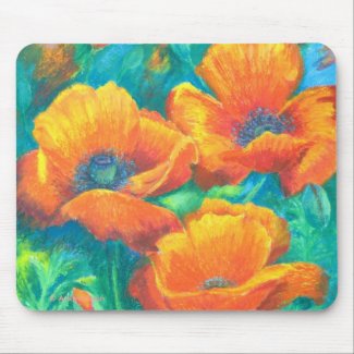
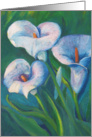
Orange Glory
This is the second one I finished. It is a rework of a failed watercolour painting.
ORANGE GLORY
30X40cm oil pastels on watercolour paper.
This is also from one of my own photos but from my English garden taken about 5 years ago.
I learnt a lot about oil pastels with this painting. I was having trouble with it and thought I had spoilt it completely. But because I left it alone for a while, when I came back to it I was able to over work it with quite a few more layers and even completely change the shape of the bottom poppy.
I'd be interested in your opinions on these as I quite like the way the turned out although I did wonder if oil pastels was too heavy a medium for the subject.
I had fun creating some art gifts on zazzle
Welcome to my floral art blog. A place to share my passion for art combined with flowers of every shape and size.
Friday, July 23, 2010
Poppy madness


Sunday, June 13, 2010
Poppy Medley
Poppy Medley 30x30cm coloured pencil on sanded card.

Initially I planned to do this painting in oil pastels, but something made me decide to use coloured pencil which I hadn't used for quite a while.
I sharpened my pencils and set to work on stage 2 - making the colours look 'real'
This is the stage where it starts to look more like the objects. I decided that I need more of this 'colouring' stage and here is stage 2.2
Definitely starting to look like flowers now!
Stage 3 is finding the changes in plane and lights and shadows on the petals by dividing the larger masses into smaller masses.
The light through the petals is starting to show.
Stage 4 is more of the same - splitting the masses and really looking at the colours and pushing them and putting in that all important centre of the main poppy.
I enjoyed painting this one and the coloured pencils worked well on the sanded paper which did not use up the pencils as much as I thought they would.
This painting is from the May Plant Parade challenge on Wet Canvas. I cropped one of the photos and painted the underpainting in my usual way but this time using water solouble neopastel and water to cover the paper. I have used the neopastels for the under painting on several oil pastel paintings and it works well for me.
Initially I planned to do this painting in oil pastels, but something made me decide to use coloured pencil which I hadn't used for quite a while.
I sharpened my pencils and set to work on stage 2 - making the colours look 'real'
This is the stage where it starts to look more like the objects. I decided that I need more of this 'colouring' stage and here is stage 2.2
Definitely starting to look like flowers now!
Stage 3 is finding the changes in plane and lights and shadows on the petals by dividing the larger masses into smaller masses.
The light through the petals is starting to show.
Stage 4 is more of the same - splitting the masses and really looking at the colours and pushing them and putting in that all important centre of the main poppy.
I enjoyed painting this one and the coloured pencils worked well on the sanded paper which did not use up the pencils as much as I thought they would.


Monday, March 22, 2010
Spring Jonquils
25x32cm oil pastel on black somerset velvet paper.
The Floral and Botanicals forum of wetcanvas.com January challenge was to paint white flowers. One of the supplied references was a lovely photo of some white jonquils which I couldn't resist. Painting white flowers is quite a challenge for me as I find it extremely hard to get the right balance of white and shadows.
I have started painting in oil pastels instead of the soft pastels to avoid the dust created with the soft pastels. They act totally different to soft pastels and using them is a whole new experience. I really enjoy using them although I consider myself a newbie with them.

This is my stage 1 where I block in the highlights and shadows with warm and cool colours.
This is stage 2 where I start changing the colours to look 'real'.
This is stage 3 where I look for the different light and dark planes in each block of colour and start the layering process to give a more 3D effect. I am using creams and whites for the highlights and blues and purples for the shadow areas. The flowers are starting to come alive now.
Stage 4 is more layering, I go over some of the highlights with yellow covering that with more white. I also blend some areas to achieve a smoother change from the highlights to the shadows. After leaving the oil pastel to set for a couple of days, I then look at the painting to assess if there are any final changes needed. I changed the angle of a couple of the petals and layered more whites and blue in the shadows. Overall, I was quite pleased with the result.
The Floral and Botanicals forum of wetcanvas.com January challenge was to paint white flowers. One of the supplied references was a lovely photo of some white jonquils which I couldn't resist. Painting white flowers is quite a challenge for me as I find it extremely hard to get the right balance of white and shadows.
I have started painting in oil pastels instead of the soft pastels to avoid the dust created with the soft pastels. They act totally different to soft pastels and using them is a whole new experience. I really enjoy using them although I consider myself a newbie with them.
This is my stage 1 where I block in the highlights and shadows with warm and cool colours.
Stage 4 is more layering, I go over some of the highlights with yellow covering that with more white. I also blend some areas to achieve a smoother change from the highlights to the shadows. After leaving the oil pastel to set for a couple of days, I then look at the painting to assess if there are any final changes needed. I changed the angle of a couple of the petals and layered more whites and blue in the shadows. Overall, I was quite pleased with the result.
Saturday, March 13, 2010
Art cards
I have been selling cards at Greetings Card Universe (GCU) for a while now. I use my paintings and photographs to create original cards. I thought I would share with you some of my art cards for easter/spring available via GCU. These cards make

These cards are a card and gift at the same time as they can be framed as a keepsake by the recipient.


These cards are a card and gift at the same time as they can be framed as a keepsake by the recipient.


Tuesday, January 19, 2010
Flower studies in pastels
I challenged myself by setting a time limit for these two studies. I allowed myself 20 minutes for each.
I wanted to see if I could achieve a nice loose painterly feel, which I think I have managed. Both of these studies are in soft pastel, on Fisher sanded paper. Both are 20x20cm (8"x8").
I have used this image to create a blank art card available from GCU
Pink Rudbecka Fine Art Card
The mimosa painting was looking a bit dull and I wondered what could be done to liven it up. I remembered a tip I'd been given by another wet canvas member (colorix). Using a grater I grated some soft pastel in yellow and dark green over the painting. This was very effective. I was surprised about how effective this was. A little bit, went a long way. I then pressed the gratings into the paper by applying pressure to a piece of tracing paper laid over the top. The 'bits' have stayed firmly in place. Mimosa is grown here commercially on the Cote d'azur mainly for the perfume industry in Grasse. In late January/beginning February the hills around Cannes are covered in yellow. A wonderful sight.
I have used this image to create a blank art card available from GCU Mimosa Fine Art Card
I wanted to see if I could achieve a nice loose painterly feel, which I think I have managed. Both of these studies are in soft pastel, on Fisher sanded paper. Both are 20x20cm (8"x8").
I have used this image to create a blank art card available from GCU
Pink Rudbecka Fine Art Card
I have used this image to create a blank art card available from GCU Mimosa Fine Art Card


Subscribe to:
Posts (Atom)