Monday, June 29, 2009

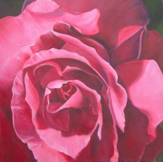
Pink Rose


Pink Rose
Acrylic painting
40x40cm on box canvas
 
I painted this rose as part of a monthly challenge on wetcanvas.
The challenge was to paint a rose macro in a colour you found difficult. I always find pinks difficult as they can come out either too sugary, too blue or too red.


The reference is from a rose in my garden. The area where I live, used to be very well known for growing roses for the perfume industry in Grasse. This rose was planted by the previous owners of my property.


Stage 1, Underpainting.
The rose was drawn onto the canvas using watercolour pencil. I then blocked in the darks using cool colours e.g. purple, blues, blue greens and greens, and the lights using warm colors oranges, reds and yellows. I used yellow for where I wanted the lightest highlights.


Stage 2


Paint was added to each area to make the colour look more 'real' I used alazarin crimson for the shadows and permanent rose for the lighter areas, mixed with white to a lesser or greater extent. I used titanium white and some mixing white.


The mixing white makes the colour more transparent, but titanium white gives a better colour, although it is quite opaque. I also mixed the alazarin crimson with ultramarine blue in places.
The paint was added dry, with a scumbling motion. Several layers were used to help get the correct tone.


Stage 3
More pink - permanent rose plus white was added to the light areas. A red layer was also added to the darker areas to give a warmer shadow and then overpainted with alazarin crimson.
To get to stage 4 (the finished piece) I scrumbled a layer of permanent rose all over, before putting on the last coats of pink. The permanent rose layer helped to lessen the 'chalky' look of some of the pink. I also used much thicker paint on the light petals.
Lastly, I used a lot of white in the highlights to give a very light pink and increase the contrast at the focal point.

Sunday, June 14, 2009

Parrot Tulip Dance Pastel Painting


PARROT TULIP DANCE
Soft Pastel 40 x 60cm on wallis paper

This painting was created from a photo I took at a local village flower show. The flower show is an annual event and the whole village including the castle/chateau is festooned with flower arrangements. It really is a must to see if you are ever in the French riviera in April.


Following on from painting pastels the colourful way, I decided to try the technique on a flower subject and the vibrancy of these parrot tulips just cried out to be painted.

Step 1 - I drew the parrot tulips and blocked in with colour, using cold colours for the darks and warm colours for the lights.


Step 2


Overpainting the underpainting to make the colours 'look right'.


Definitely a strange looking stage.


Step 3

Dividing the blocks of colour into 3 or 4 areas and finding the light and dark planes.


Starting to look like the parrot tulip


Step 4

Is a continuation of step 3. Dividing each of the areas created in step 3 again into 3 or 4 and digging deeper to find the changes in plane and colour. Any detail is also added in this last step.


Sunday, January 25, 2009

Painting the colourful way - Round study


I decided to use an orange for my colour study.

This is on the reverse side of a cream Ingres paper, A4 size. And yes, the shape of the orange is a bit squashed.

I forgot to say that we are using a limited range of pastels for this workshop so it is economical too.

Step 1


Laying in the blocks of colour to differentiate the lights from the darks, using warm colours for the lights and cool colours for the shadow areas, but not using local colour.


Step 2


Making it 'look real' by adding additional colour and using local colour where necessary.

No detail at this stage.


Step 3


Adding more colours to the masses to add form to the shape and to show the different light planes and including some reflected lights.


Also layering warm colours on cool colors and vice versa to add depth where necessary


Step 4

Adding more colour - dividing up the masses even more to show all the lights, darks and colours.
Also adding details as necessary.


The use of broken colour shows the under layers and adds depth. This could do with a little more work, to add some of the horizontal banding that could be seen and a more gradual blending of the colour areas.


The finished result shines with light.

Painting the colourful way - Using soft pastels


I have been participating in a workshop on the artists' site http://www.wetcanvas.com/ on how to explore colour. The workshop is using still lifes as subjects and aims to make painting them fun, which I am definitely having.


The workshop is being run by Charlotte Herczfeld [Colorix is her wetcanvas name] and is as entertaining as it is instructional. Starting with how to see blocks, it quickly progresses to how to look at round objects and then still lifes. Here is a link to her web site which shows her wonderful art and will give you some idea of what can be achieved with this method (obviously after years of practice!) http://www.charlotteherczfeld.com/


The process involves 4 steps, and some of the stages look pretty weird and strange and definitely ugly! but I guarantee you will never look at colour the same way.
To give you some idea of how this works here are the steps with my block study showing the stages. It will show you how the painting develops from something looking quite out of this world to something recognisable and full of light and colour:


In step 1 you look for the large shapes of light and dark and colour them with pure pigments but not local colours using warm colours for the lights and cool colours for the shadows.


In step 2 your attempt to 'make it look real' using local colour if necessary.


Definitely still looking ugly.


In step 3 you look for the different areas of colours within the masses.


Ugliness diminishing somewhat and some of the light coming through.
In step 4 You look for more areas of light/darks within the smaller masses and add details where needed.


Two block study,
soft pastel on A4 Ingres paper


This is, of course a condensed version, but take a look at the workshop posts for more information http://www.wetcanvas.com/forums/showthread.php?t=527268

NEXT: A STUDY OF A ROUND SHAPE.

LinkWithin

Related Posts Plugin for WordPress, Blogger...