Tangled Twigs

Autumn Vines

They are both 10x15 cm (4"x6"). They're fun to do and exciting, as the outcome is surprising. I have a couple more but I need to wait until the recipient receives them before I upload them.

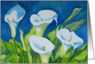
 Last of the Summer Magnolias


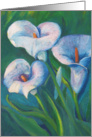
 Spring Jonquils
 This is stage 2 where I start changing the colours to look 'real'.
 This is stage 3 where I look for the different light and dark planes in each block of colour and start the layering process to give a more 3D effect. I am using creams and whites for the highlights and blues and purples for the shadow areas. The flowers are starting to come alive now.
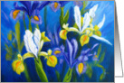


 The pink rudbeckia painting is my favourite as I love that combination of the pink with the turquoise and I like the lively feel of this one.
 The mimosa painting was looking a bit dull and I wondered what could be done to liven it up. I remembered a tip I'd been given by another wet canvas member (colorix). Using a grater I grated some soft pastel in yellow and dark green over the painting. This was very effective. I was surprised about how effective this was. A little bit, went a long way. I then pressed the gratings into the paper by applying pressure to a piece of tracing paper laid over the top. The 'bits' have stayed firmly in place.