Sunday, October 31, 2010

Swinging Datura

 
Swinging Datura
30x40cm watercolour on 140lb Langton wc paper

An appropriate painting to put up at Halloween -
"Datura belongs to the classic "witches' weeds," along with deadly nightshade, henbane and mandrake. Most parts of the plants contain toxic hallucinogens, and datura has a long history of use for causing delirious states and death. It was well known as an essential ingredient of love potions and witches' brews"
Thanks to Wikipedia for this.

Tuesday, October 12, 2010

Last of the Summer Magnolias

Last of the Summer Magnolias

40x40 cm
Acrylic on boxed canvas


I have a beautiful Magnolia Grandiflora in the garden that is over 10 metres high but I have never completed a painting of the magnolias. Towards the end of summer I thought 'Oh no I'm going to miss it again' so I immediately picked one and plonked it in a jug. It was just past it's prime but as the last one left I decided to go ahead.
I used a black boxed canvas, sketched the design using a white watercolour pencil and started to block in the darks and lights.
 Followed by a few more and gradually adding more colour.
This is with more local colour. It always looks quite scary at this stage.

I added more and more white and colour gradually lightening the petals, the next photos show the coming to life of the flower.


 I used white gesso to smooth out the form of the petal, and also mixed it with some shadow colours to soften up the graduation from light to dark.
I wanted to get the feeling of the heaviness of the flower but to show it's beauty was already disappearing. I hope I achieved some of that feeling.

Wednesday, October 6, 2010

Sunflowers in watercolour

 
Sunflower Watercolour 30x40cm 
Another sunflower painted for the same challenge as "Sunflower Fire" this time in watercolour.
To start this painting, I liberally applied masking fluid in a random pattern - squiggly lines and splashes over the paper. After that was dry I wet the paper and dropped in yellow, red and blue washes. I then sketched in the sunflowers following the reference but adapting it  to take account of the lights and darks created by the masking fluid and washes.

I used mainly pure colour, allowing it to mix on the paper. Unfortunately, not much of the highlights left by the masking fluid can be seen in the final but it is an interesting exercise to do and it gives a more spontaneous feel to the painting.

Initially I was a little disappointed in the result as I feel I did not leave enough highlights, but now that it is thoroughly dry it is growing on me.
Certainly a technique worth trying again.

Some products featuring this artwork

Sunflowers Floral Mouse Mat mousepad
Sunflowers Floral Mouse Mat by Marionsart
View a different mousemat on zazzle

Tuesday, October 5, 2010

Sunflower Fire

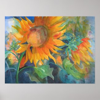
Sunflower Fire30x40cm soft pastel on sanded card.


 This painting is also from another challenge on Wetcanvas.com and thank you to Kay (KreativeK) for providing it.


I know I said that I was no longer painting with soft pastels, but I keep getting drawn back in to using them and the strong colours in the reference shouted soft pastels at me. I discovered some Sennelier fine sanded card in my cupboard which I had purchased way back and actually forgotton I had.
As usual, I started out by blocking in the lights and darks. I used Neocolor II soluble crayons as an underpainting. I've been using these a lot just lately regardless of medium, they have a lot of pigment in and I find that they give a very good underpainting. I usually use water to wash the pigment in, but then remembered the Sennelier surface doesn't like water, so I used alcohol instead. The wash came out darker than I expected it to and was not quite so easy to create as I am used to. Recently I have been using Fischer sanded card and this accepts water and my washes are normally lighter.

Sunflower Fire stage 1 -
I used cool colours for the shadows and lights for the highlights. In my florals I like to use yellow for underpainting my main highlights. I think you can see that the wash was not so successful on this ground and it looks very dark and messy.

Sunflower Fire - stage 2.
Blocking in with local colour - not looking quite so messy now.
Sunflower Fire - stage 3
More colour added - trying to find those subtle shifts of light and darks. Taking shape at this stage. 

Sunflower Fire - completed.

I continued layering colours and breaking up the blocks of colour until I was happy. I knocked back the background sunflower as it was competing with the star of the show. The final touches was the speck on the sunflower head, which I achieved by grating some yellow, dark red and orange pastel over it, covering it with a piece of paper and applying pressure to adhere the particles.

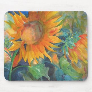
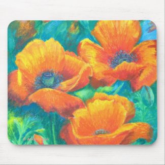
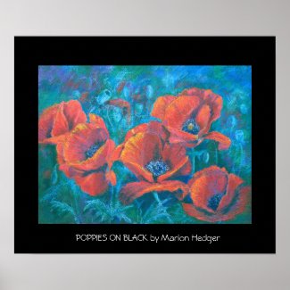
Visit my zazzle store to see products with this image
'Sunflower Fire' Poster print
'Sunflower Fire' Poster by Marionsart
Browse all the art at Zazzle
 

Friday, July 23, 2010

Poppy madness

After completing my poppy medley, I had the urge to paint more poppies. I gave myself a stern lecture and insisted I finish some half finished paintings first before starting something new.

Red poppies on black
I started this one a couple of months ago. It is in oil pastel and I wanted to see if I could portray poppies in oil pastel. I love painting them in soft pastel and I have also painted them  in watercolour and acrylic. This is from one of my own photographs of poppies in my garden here in France. I let them self seed every year and as I don't do much weeding they reward me with a wonderful show every year.

RED POPPIES ON BLACK
30x40 cm, oil pastel on Somerset Velvet paper.

The blue stands out a little too much in the photo, although I have reduced it in photshop. It's difficult photographing art work on black paper, if anyone knows of any good tips on how to do it, please let me know. The paper is a lovely paper to work on. It is a printing paper and works well for soft pastel as well as for oil pastels. It has a soft 'springy' surface and takes a lot of wear and tear.

Orange Glory
This is the second one I finished. It is a rework of a failed watercolour painting.

ORANGE GLORY
30X40cm oil pastels on watercolour paper.

This is also from one of my own photos but from my English garden taken about 5 years ago.

I learnt a lot about oil pastels with this painting. I was having trouble with it and thought I had spoilt it completely. But because I left it alone for a while, when I came back to it I was able to over work it with quite a few more layers and even completely change the shape of the bottom poppy.

I'd be interested in your opinions on these as I quite like the way the turned out although I did wonder if oil pastels was too heavy a medium for the subject.


I had fun creating some art gifts on zazzle


LinkWithin

Related Posts Plugin for WordPress, Blogger...